Choosing a backsplash tile can be a difficult process, but don’t feel overwhelmed because here are some backsplash ideas for your kitchen! You kitchen will already likely have many elements in it that will narrow down the right back splash for you. Color is a key element that can make your backsplash stand out in a good or bad way. Here is how to make sure that you select the right color for your home.
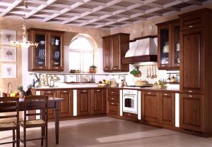
When selecting a color you will want to consider what the existing colors of your space are. Do you have a bright colored wall? Do you have painted or stained cabinets? Are they dark or light? What is the material of the flooring? You will want to pick a color that compliments these elements to do this start by taking a look at your color wheel. Generally color schemes are based in one of two ways; analogous colors, or three colors side by side on the wheel and complementary colors, which are two colors directly opposite one another. Take a look at your kitchen and see which pattern the two largest color swatches follow, are they similar with light wood cabinets and pale ceramic tile flooring or are they contrasting with a bright turquoise wall and white cabinetry. Be careful here if both of the major colors are neutrals, white, grey or brown. They may appear to be on opposite sides of the color wheel; however, we will treat them as if they are analogous. Once you have decided what type of color scheme you have, coming up with backsplash ideas for your kitchen will be a breeze. If you have an analogous scheme pick a color that is on the opposite side of the color wheel, with a complimentary scheme pick a color that is next to one of your existing colors.
One thing to keep in mind is that color has other properties than just hue, where it is located on the wheel. These elements will help to ensure the right color for your backsplash is selected. Value is how bright the color is; a neon green will have a higher value than a deep blue; it is used to compare different hues. Tint and shade tell you how true the color is to the original hue. Tint will tell you how much white or black is added to the color, think of looking at an ocean from a plane – some areas will appear much darker or lighter than others but they are tints of the same hue. Lastly there is saturation, this is a color’s intensity, or how much grey there is in the color – this will tell you how pale or strong the color is. Saturation is the difference between a vivid and a pale yellow.
A great backsplash idea for your kitchen is to select colors with similar elements for example, if all of the colors in your kitchen are pale (low saturation) make sure your backsplash mimics this. Don’t be fooled if you don’t automatically see the colors of your kitchen on the color wheel, you may need to look at a wheel that includes more of these other elements! A complete color wheel covers every color in existence.









Tell us what you think about "Backsplash Ideas for a Kitchen with Photos"?